ShopDreamUp AI ArtDreamUp
Deviation Actions


Suggested Deviants


Suggested Collections


You Might Like…


Featured in Groups

Description
kinda productive these days...  (Smile)")
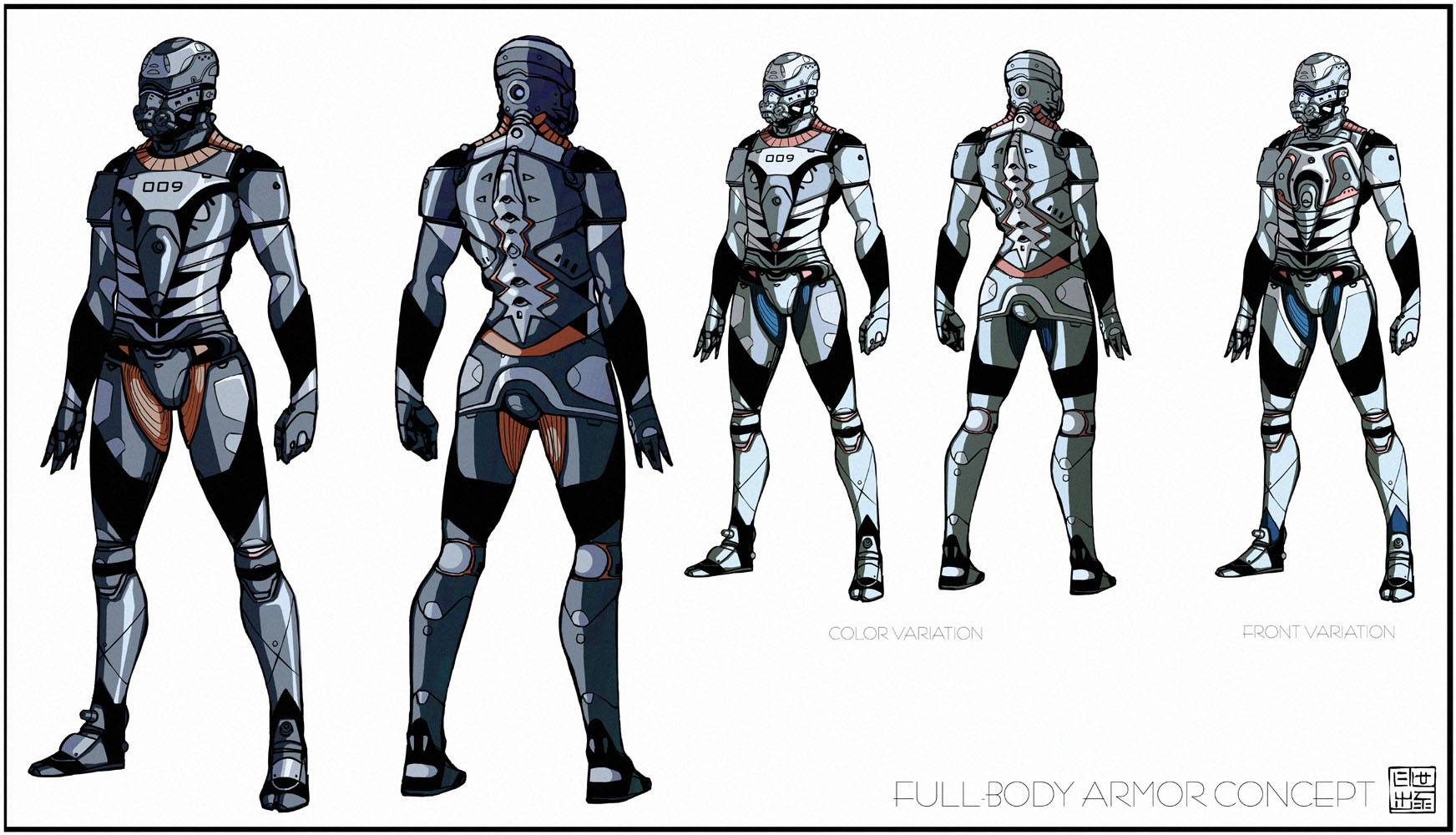
So, this is a full-body version for the cyborg head design I did recently. I still intend to do a litte 2D animation sequence, if time and know-how allows and this is gonna be the main protagonist.
Well, I was tweaking the design more than once, definitely like the rear view way better than the front.
I have this alternative chest plate, but it's too crowded and would be tedious to draw over and over again when animating. Still, then I'd of course draw him more simplistically...
Also, another take on color, always have a hard time choosing something slick. Went for cell-shading, but I might do a little painted piece some time showing off the character (Wink)")
All in all, I don't consider this concept to be very original, I always end up using the same design cues. Plus, my anatomy sucks big time! I'd love to go for some stylized proportions... his silhouette looks much too ordinary. :/
Hm, mabye if I am in the mood, I'd redesign some parts...?
Got crits?
edit: the Cyborg 009 reference was unintentional! I don't even know the series")
So, this is a full-body version for the cyborg head design I did recently. I still intend to do a litte 2D animation sequence, if time and know-how allows and this is gonna be the main protagonist.
Well, I was tweaking the design more than once, definitely like the rear view way better than the front.
I have this alternative chest plate, but it's too crowded and would be tedious to draw over and over again when animating. Still, then I'd of course draw him more simplistically...
Also, another take on color, always have a hard time choosing something slick. Went for cell-shading, but I might do a little painted piece some time showing off the character
All in all, I don't consider this concept to be very original, I always end up using the same design cues. Plus, my anatomy sucks big time! I'd love to go for some stylized proportions... his silhouette looks much too ordinary. :/
Hm, mabye if I am in the mood, I'd redesign some parts...?
Got crits?
edit: the Cyborg 009 reference was unintentional! I don't even know the series
Image size
1744x1000px 299.94 KB
© 2008 - 2024 Hideyoshi
Comments82
Join the community to add your comment. Already a deviant? Log In
Wow, this armor is really great and cool, nice work with this art Hideyoshi